
Gray is here to stay
For a little while longer, anyway
Gray has been the neutral wall color of choice for the last several years, so you still have a few more years to jump onboard the Gray Train. Neutral room palettes splattered all over Pinterest and Instagram give the illusion that no one uses color anymore. Gray EVERYTHING is trendy, but gray itself is timeless. Choosing the right shade, and adding the best complementary colors will give your home the update it’s crying out for.
1000 shades of gray
True gray is nothing more than a color mix of black and white. And that’s it. But take that gray, blend in any color for an undertone, increase or decrease the tint – darker or lighter (more black or white) and you have countless shades of gray to choose from.
How do you know which one is the right one for you?
UNDERSTANDING UNDERTONES
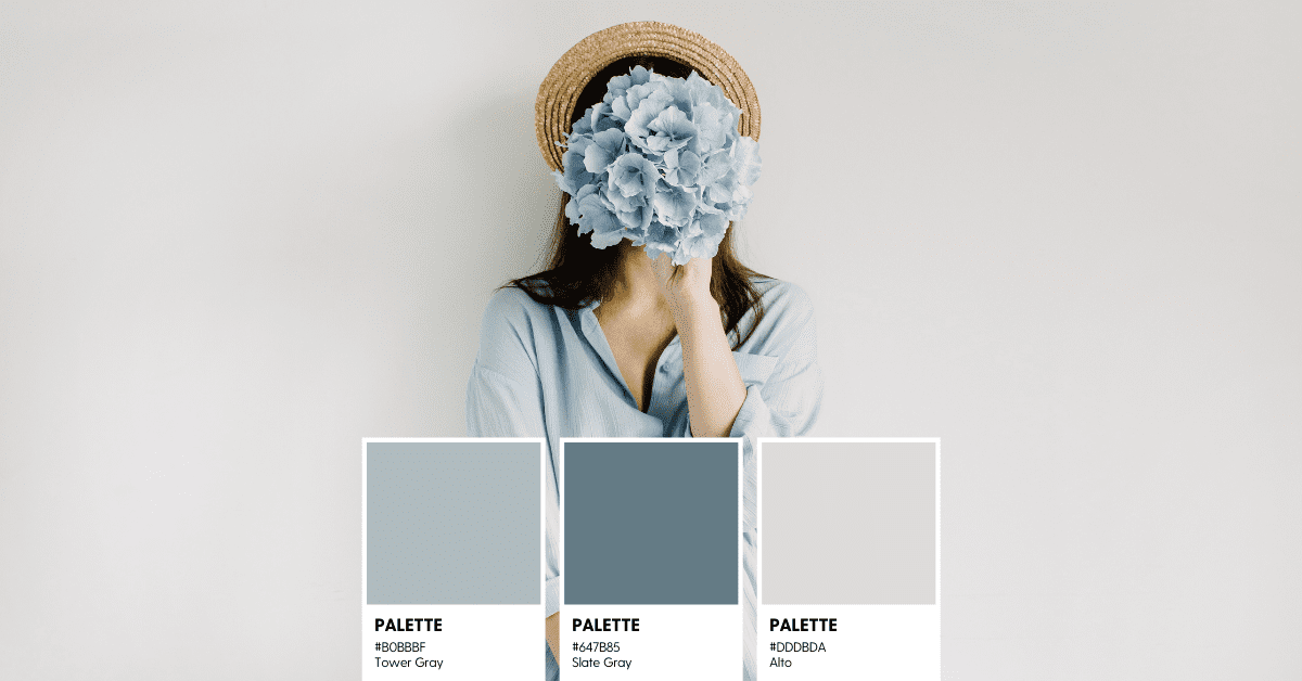
Gray Undertones
When looking at undertones, hold a gray paint swatch next to pure white. You’ll be able to see the blue, green, purple,(cool) yellow, orange, or red (warm) undertone of the gray. When you’ve chosen the gray for your walls, use the same undertone color to choose the accent pieces, furniture, or artwork to compliment a warm or cool color scheme.
Warm Grays
Warm grays have more of an earthy undertone. Red, yellow, orange, or brown turn gray into a neutral warm color. Earthy, fire, autumn as dusk.
Adding the more neutral warm gray to your space will give you a cozy and more neutral color. Griege (which takes gray and marries it with beige) is a great choice for living rooms and bedrooms.
Cool Grays
Cool grays have an undertone color of blue, green, or purple. Think silver, crisp, icy, cold, a cloudy, rainy day.
These colors go great with white cabinets, more modern design schemes, and dark wood floors. A cool gray will add a crisp, light, and airy feel to any room. Use a cool gray to create an urban minimalist vibe, or when coordinated with blues and greens, you’ve got yourself the farmhouse style.
")
Trendy is “the entire room is 50 Shades of Gray”. Trendy is photos of rooms edited with color-removing, less saturation, or gray photo filters. Trendy is EVERYTHING IS GRAY.
Timeless is the neutral aspect of gray itself. Whether you choose warm or cool gray walls, adding bright, earthy, exotic, pastel, or other neutral colors to the mix will add personality and uniqueness to your room. And the reverse is also true about this color – Timeless is gray for a few perfect pieces, in a rug, or as an accent color.
Tip #1
Gray is great, but if you exclusively use shades of gray, you’re creating a very sterile and boring environment. An all gray environment is great for photoshoots, but in real life, it can be a little bland.
Tip #2
Use gray to coordinate with other colors. Just remember to stick with all cool, or all warm tones – it’s tough to get those two types to work together, and something will always look a little “off” when you mix them.
The grays in my home are all cool. Mostly Blue, but my sofa is more green-gray (it was on sale and is seriously the most comfortable sink-in marshmallow-cozy couch I’ve ever sat on – so the green undertone is perfectly fine). Coordinating both my green-gray sofa and the blue-gray dining chairs with the wall paint was a little tricky. I have an open floor plan, so the walls all had to be the same color. I knew I needed a “cool gray”, but it couldn’t be too heavy with either green or blue undertones. I had to find a neutral gray that would work with my furniture. I looked at SW Agreeable Gray (it seemed to be all the rage on the internet), but with the beige undertone, it was too warm. SW Repose Gray is also a very popular gray. I love it, it’s great, it’s light and popular because of its soft barely noticeable warm undertone. But it didn’t quite work in the room I needed to paint. Joanna Gaines uses Silver Strand as her go-to wall color, and I love me some Fixer Upper. But in the end, I chose SW Passive. A light, cool, neutral gray that fit the bill for what I was looking for.


")
Final Thoughts
When searching through the endless sea of gray paint swatches, know if you’re looking for a warm or cool undertone. From there decide if it’s a lighter or darker shade you’d prefer. Hold those swatches up against a pure white background (interior door trim usually works) to see what color undertone is actually there. And lastly, see what it looks like in your room as the lighting changes throughout the day. Colors appear lighter on larger surfaces, so a shade darker may get you to the actual color you want. And when searching for exterior paint, always go 2 shades darker than the color you want, as the sunlight will brighten your paint color quite a bit.
Color is tricky, undertones aren’t always obvious, and lighting can change your perception. When in doubt, find a color specialist or a designer to give you suggestions and advice. And of course, you can always do your research on the good ol’ interweb!
")
This post may contain affiliate links. Danelia Design is a participant in the Amazon Services LLC Associates Program, an affiliate advertising program designed to provide a means for sites to earn advertising fees by advertising and linking to amazon.com. For more information, please read my disclaimer here.


